WRITING SAMPLE
Boost Your Visual Storytelling: Graphic Design Basics for Social Media
As a content creator, you’ve probably heard that it’s best to keep text-based images to a minimum on your social media channels. But, depending on the account’s purpose and goals, sometimes a little graphic design is necessary for things like flyers, infographics, quotes, reminders, or announcements. If you’re a design novice, it’s tempting to choose a random Canva template, throw something together in a Word document, or even let AI handle it for you. But before you hit “post,” take a moment to think: Do you want content that’s just easy, or content that truly stands out?
“Good” design — a.k.a. thoughtful, organized, and cohesive design — can help establish and maintain your credibility, grab your followers’ attention (for the right reasons), and make your communication efforts more successful. Most people on social media have short attention spans and skim instead of read. Still, users are more likely to pay attention to, retain, and act on information if it’s presented effectively. This idea doesn’t only apply to social media — for example, based on the flyers below, which of these events appeals more to you?

Which of the menus below would you prefer to read and order from?

If you were looking to lease a car, would you consider using the website below to do so?

The examples above illustrate one of the most important things about design: it’s not all about aesthetics. The first question to ask yourself when evaluating design work is not “Does it look pretty?” Instead, you should ask yourself, “Does it work?” Meaning, can the reader understand what they are looking at? Is all the necessary information and context present? If there is a call to action, is it obvious what that action is? Is an urgent message getting lost in translation?
Contrary to popular belief, design is not synonymous with art. Creations can certainly be both, and there is nothing wrong with art, but design has a job to do. Unlike art, design is structured, objective, and needs rationale — looking pretty comes afterward.
You don’t need to be a full-fledged designer to be a great content creator for social media. But with just a bit of design knowledge, you can add another tool to your toolbox and become more confident in your work. There are four principles of design you should learn and implement: proximity, alignment, repetition, and contrast.
Proximity
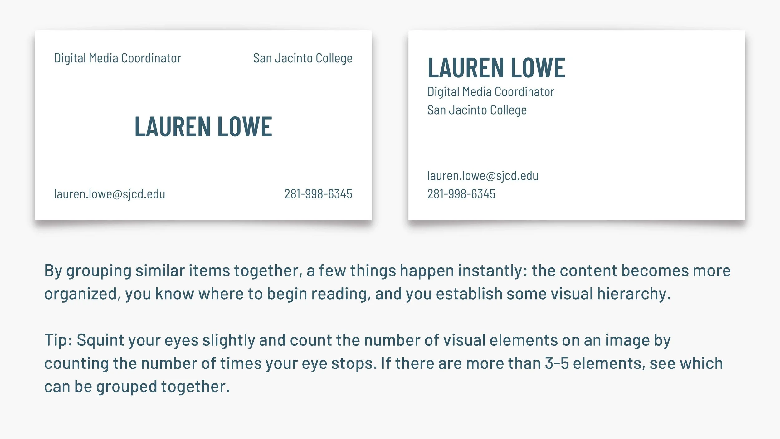
According to Robin Williams in The Non-Designer’s Design Book, we see objects that are close to each other as more related than objects that are far apart. Therefore, we should group related items together. The purpose behind this principle is organization — information that is organized is more likely to be read and remembered.
Create relationships with elements in close proximity, and avoid creating relationships between elements that don’t belong together. Avoid leaving the same amount of space between visual elements unless each is part of a broader group. (e.g., use less space between a heading and its corresponding paragraph than you use between the bottom of that paragraph and the next heading, like I did above!)

Alignment
In her book, Williams also said that nothing should be placed arbitrarily. Every element should have a visual connection with something else on the page. This principle forces you to be intentional. When items are aligned, the result is a stronger, cohesive unit.
Even if elements are physically separated, your eye creates an invisible line that connects them. Strong alignment also leads the reader’s eye around the image.
A Note on Center-Aligned Text
It’s common for beginners because it’s comfortable, but center alignment should mostly be avoided. If used, it should be a conscious decision, not a default. Center alignment eliminates the invisible straight line discussed above — plus, it typically feels overly formal. Bodies of text (longer than two lines) should never be center-aligned. Also, you don’t want to mix center alignment with right- or left-justified.

Repetition
Repeat aspects of the design. Find at least one thing that will tie everything together. This principle goes further than being naturally consistent — according to Williams, it’s a conscious effort to unify all parts of a design.
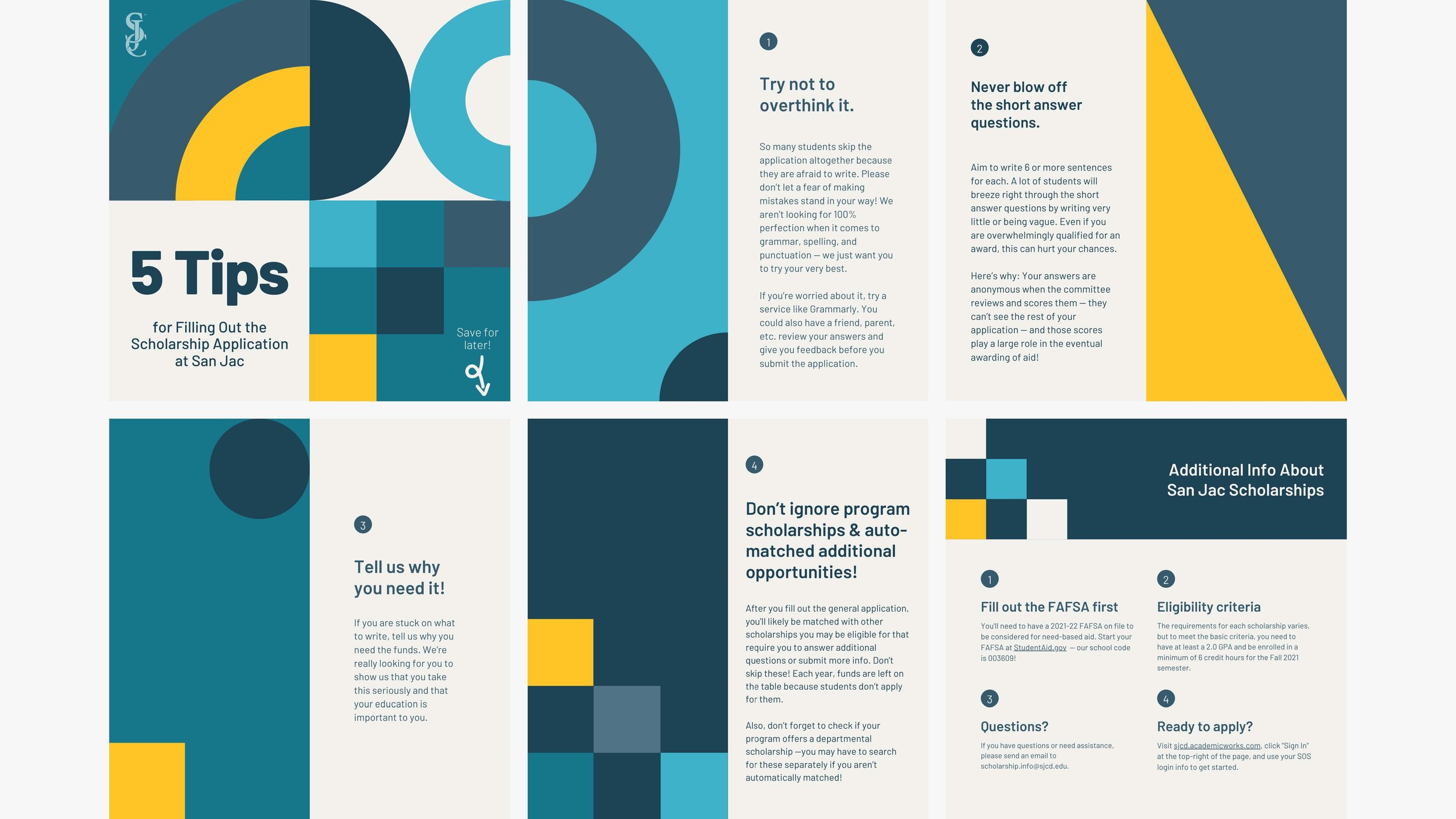
The purpose of this principle is to add unity and visual interest. After all, an interesting-looking image is more likely to be read. Start by finding existing repetitions and push them further, but don’t repeat an element so much that it’s annoying or overwhelming. This principle is especially applicable to projects with multiple images or pages, like an ongoing series or carousel posts.
This is something people often do naturally, to a degree. To put this principle in a broader context, you use repetition when you use the same font size in one sentence as you do the next, when you choose the same color for all your text boxes, and when you follow your company’s brand guide.

Contrast
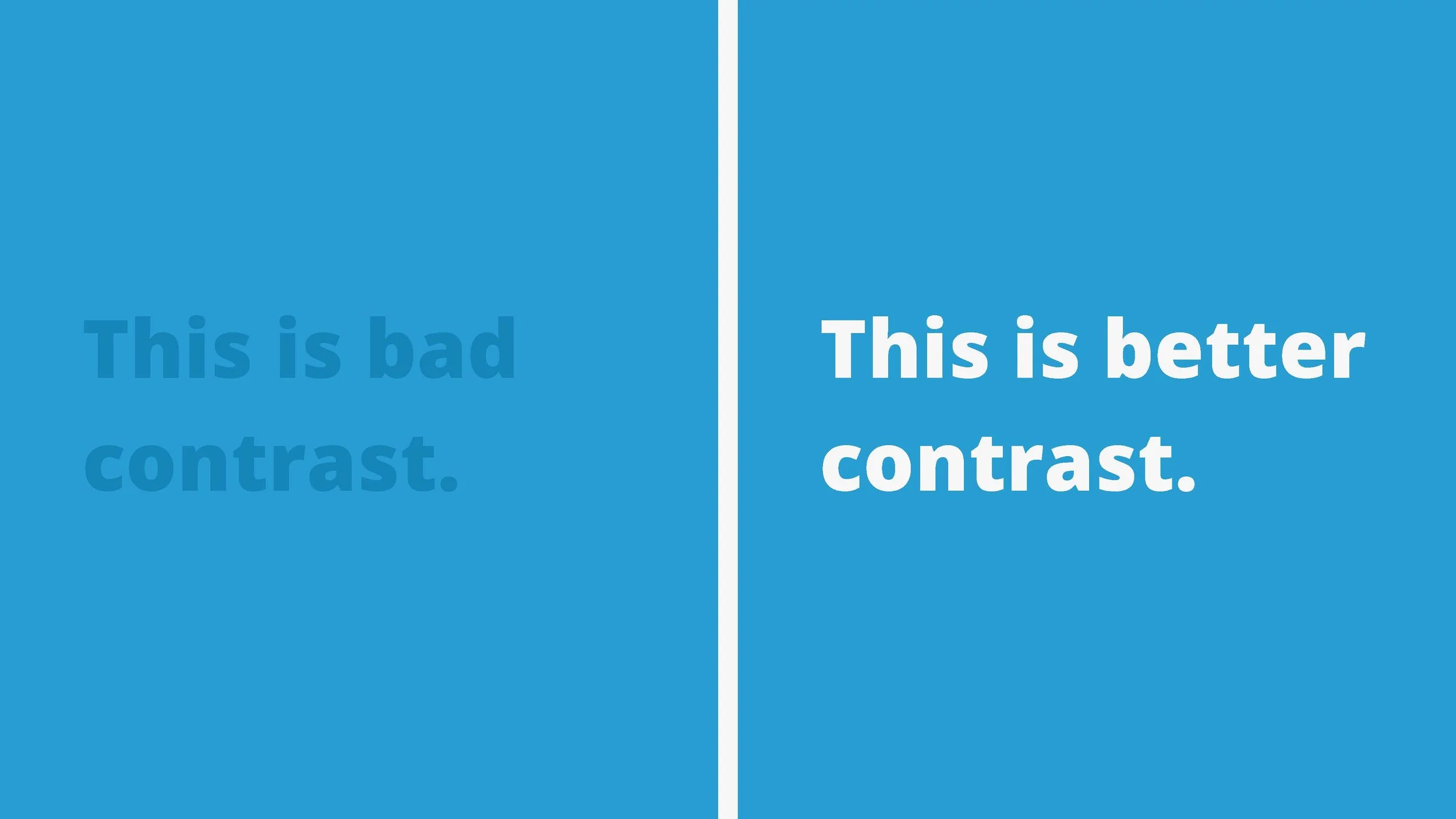
If two elements are not the same, make them different — very different. According to Williams, you should do this to provide organization and visual interest. Contrast various elements of the design to draw the eye. Use contrast to organize information, clarify the hierarchy, guide the reader around the page, and provide a focal point.
The principle of contrast is used in myriad ways, but you can’t be timid about it. For example, it’s not enough to make your headings one size larger than your body text. Make the text bolder, bigger, a different color, etc.


When applying this principle to color, an easy trick for testing the strength of your contrast is to convert the image to black and white. While both colors in the image to the left are much different than the teal background, we can see in grayscale on the right side that the purple is too similar in brightness to the teal background. High color contrast is vital to the legibility of your design and is a necessary practice to make your content accessible to users with visual impairments.
Using All Four Principles Together

Let’s start with this image as an example. The center-aligned text and Times New Roman font look very old-school. The even spacing between each line of text makes it difficult to separate elements. The lack of contrast in font size, color, or weight — the boldness range of a font — creates disorganization.

When we add proximity by grouping the related elements, we create a stronger visual hierarchy. It’s now easier to skim the image for information.


Next, adding proper alignment creates that invisible line that guides our eye around the image. You can use an image to provide an anchor for your alignment, like the version on the right.

For repetition, let’s add the same bold text and line element for the days of the week. At this point, we’ll also change all the text to a more modern font.

Adding strong contrast between the heading, subheading, and body creates even more organization.
Now, let’s compare the first and last images. Is the final result pretty? Not necessarily. It’s still a little boring because there is no color or other visual interest. But does it “work” better than the original? Absolutely!


Conclusion
Design doesn’t have to be intimidating — as you can see above, even small adjustments can make a big impact. By applying these four principles of design, you can elevate your social media content from “good enough” to truly effective. The next time you create a graphic, take a moment to assess whether your design is clear, engaging, and well-structured. When design does its job well, your message reaches more people — and that’s what truly matters.